

Portfolio : Identity Design


Dissident Records & Books
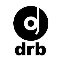
Clarity, contrast, and directness were the key concepts with this task. The goal was something iconic that would work as well on the back of a CD case as on the spine of a book. DRB's owner was very fond of a clean, round, full font style, so a logo had to complement that while still being able to stand on its own.
The resulting design uses the stylized shapes of a record player arm over a vinyl disc to create the shape of a "d".