

Portfolio : Print Design


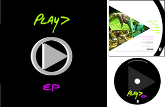
PLAY> - EP CD
This design was for a promotional EP by the Portlan, Ore. band PLAY>. The band's leader was looking for something stark and direct which used his band-logo "play" symbol. The result makes use of this symbol on all pieces of the packaging (front, back, and disc) but in different ways, to provide a visual tie without redundancy. The typography also reflects the band's aesthetic, combining actual handwriting by the bandleader and old typewriter-like text. The cover layout and color scheme is simple, vivid, and echoes influences including old Joy Division packaging. (Read more about PLAY>)